Projects

The Great Repair

Rethinking existing materials: from the paradigm of repair to a design principle

Info

Design

  • Editorial
  • Visual Identity

Challenge
How can the potential of repair be made visible? A visual identity for an exhibition project initiated by ARCH+.

Approach
Inspired by the artistic and theoretical positions of the project, our design creates something new from existing materials.

Result
A flexible design system with a distinctive character that visually references the discourse on repair.


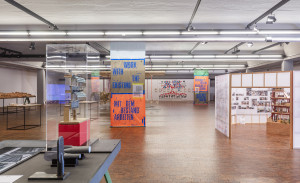
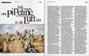
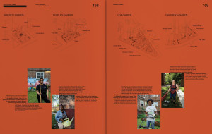
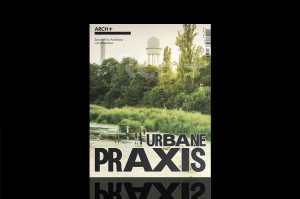
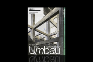
In two magazine issues and an exhibition, the magazine for architecture and urbanism ARCH+ presents artistic and theoretical contributions that deal with the principle of repair as an alternative to the global wasting of resources. Inspired by the positions of the exhibition project, we design a characteristic appearance that uses the old to create the new.

1/10
1/10

An exhibition project on repair
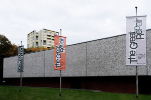
Things cannot go on as they have been doing. We live in a throwaway society that wastes resources and is destroying our planet. What could an alternative look like? ARCH+ together with Milica Topalović (Department für Architektur, ETH Zürich) and Florian Hertweck (Faculté des Sciences Humaines, Universität Luxemburg) are exploring the potential of repair. The editorial and curatorial team presents two magazine issues and an exhibition at the Akademie der Künste, Berlin, entitled The Great Repair, which consider repair as a new design paradigm.

Repairing means working with existing materials – rebuilding what is already there and developing it further. While restoration tries to recover an earlier status quo, repair takes a critical look at the source material. Repairing changes, complements, and creates something new.

Questioning the status quo as a design principle
This central quality of repair inspires our design principle for the visual appearance of the publications and the exhibition: we question existing material and reorganise it. Our source material for this is Helvetica and Times – the two house typefaces of ARCH+ magazine.

We disrupt the normative character of the world-famous typefaces by inverting the familiar typographical order. We swap the horizontal alignment of capital letters (e.g. ‘A’) and lower-case letters with descenders (e.g. ‘g’). In addition, we reduce the spacing and remove the spaces between the individual letters. Both these changes hinder the usual flow of reading, irritate, and, at the same time, create a new set of rules. The result is a characteristic appearance that translates the discourse on repair into a visual format.

The exhibition The Great Repair can be viewed from 14.10.2023–14.1.2024 at the Akademie der Künste, Hanseatenweg, Berlin.

Views of the exhibition, tour and opening: © David von Becker.

Contact person

André van Rueth
Design
Mail

More

German Pavillon 2023
Visual identity for the German Pavilion 2023.

Arch+
A magazine for architecture and urbanism.