Wanting to learn instead of knowing already.
Info
- Jewish Museum Berlin
- 2017
- Website
Strategy
- Narrativ
- Brand Strategy
Design
- Visual Identity
- UX/UI
- Editorial
Transformation
- Vision/Mission
- Corporate Philosophy
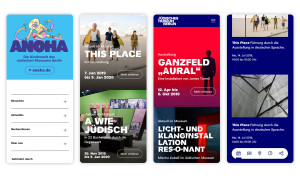
The Jewish Museum Berlin (JMB) is more than just an exhibition space. It is a place of diversity that invites us to think about society. For open, respectful discourse. Europe’s largest Jewish museum is going to enhance this position further and grow in every respect in the spring of 2020: with a newly conceived permanent exhibition, a children’s museum and a new image that we have developed – including the brand strategy, brand architecture, mission statement process and the JMB Pro typeface family.
At a time when constant indignation, segregation and exclusion are defining public dialogues, the JMB is encouraging us to “Think out loud.” Our brand idea is an invitation to people who have questions, are curious, want to understand. Who want to listen, express themselves, keep in touch and remain part of the conversation. Wanting to learn instead of already knowing. Diversity instead of black and white.
The JMB and we have lived the brand idea throughout the entire process: we were able to work agilely on the brand and mission statement with a permanent team from the museum. The idea became the strategy became the design. Like the museum, it does not stand still. The will to change and discourse characterise the design.
Our brand idea “Think out loud” is an invitation to people to stay curious, to listen, to get in touch with each other. A plea for diversity and mutual respect.
Doris Schlieper
Brand strategy
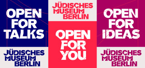
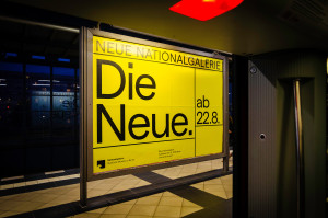
Our new JMB Pro font is everywhere in this image. It is a clear commitment to diversity and a change in perspective. The JMB Pro consists of classic letterforms, from regular to black, and a headline font that contains a variety of style characteristics per letter. They are typed out at random. Instead of “one correct” form, there are several.
Like the Jewish Museum Berlin, its image does not cower away. It celebrates individuality and cultural pluralism.
Our font is like spoken language, it is alive and undergoes transformations into ever new constellations.
Stefan Becker
Design