Orchestra, man, metropolis.
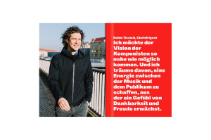
Cosmopolitan through closeness – that was the fundamental attitude that formed the basis of our further development of the Deutsches Symphonie-Orchester Berlin brand. We were fascinated not only by the orchestra’s close connection to its charismatic chief conductor Robin Ticciati, but also the way in which the identity of the DSO is shaped by Berlin and how it leaves its mark on the city: awake and alive.
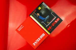
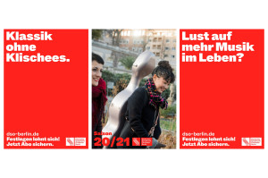
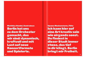
First of all, we simplified the logo: more robust, more compact, more modern and thus easier to read. The S-shaped wavy line emphasises the independent personality of the DSO, appropriate for an orchestra that shakes up the highly ritualised concert business with casual concerts, flash mobs and unusual venues. From the 2020/21 season, the DSO showed itself as it is: keen to experiment, committed, curious. It makes itself known and takes a stand. Musically and as part of the city.
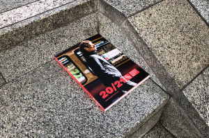
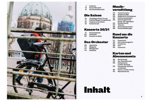
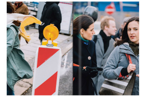
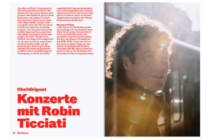
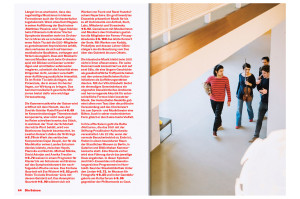
The OSTKREUZ photographer Jörg Brüggemann was our preferred partner for the photo series for the season, which became an important part of the external image. Over four days, we accompanied the musicians and Robin Ticciati to venues in Neukölln, Mitte and Charlottenburg. The result was images that exude closeness, familiarity and joy – authentic and not staged.
