Banking with Integrity. Reimagined.
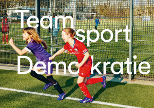
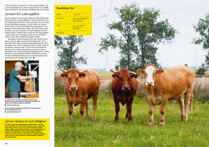
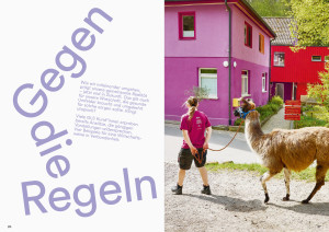
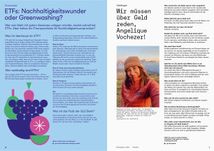
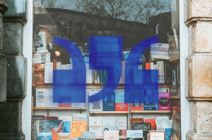
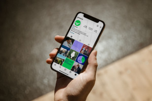
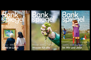
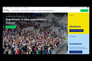
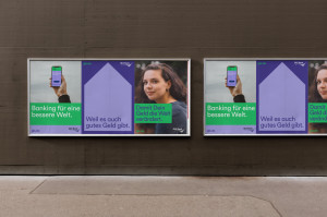
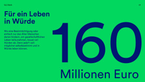
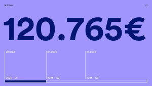
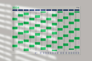
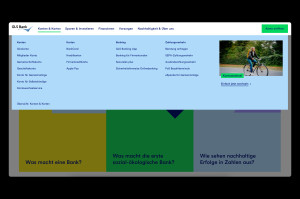
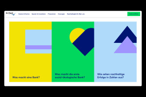
A new corporate design and confident language are intended to express the character and attitude of GLS Bank in analogue and digital communication. To this end, Stan Hema developed the visual elements (colour, shape, font, image), animations and a brand language.
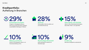
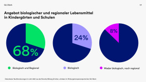
GLS Bank was founded in 1974 by a group of young anthroposophists. It was the first bank to operate based on socio-ecological principles. Today, with almost 400,000 customers, the bank finances more than 11,000 companies and projects each year focused on renewable energies, nutrition, sustainable business, housing, education, culture, social work and healthcare.
The existing GLS Bank corporate design has been expanded to include new elements and rules over the years. These additions have increasingly weakened the cohesive external image of the GLS brand. It became ever more difficult for the Marketing department to use the old CD, not least because it was scarcely implementable for digital communication.
Stan Hema worked with the GLS Bank team to develop a new corporate design and create a clear and efficient design system. The fundamental design concept: Show attitude! The geometric Circular from Zurich-based designer Laurenz Brunner was used as the new house typeface. Circular works in both the digital and analogue space and, with its curves and rounded points, strengthens the social core of the GLS brand while retaining neutrality and solidity.
Stan Hema developed a suitable brand language to accompany the visual brand components. Like the new design, it is clear, vibrant, positive and yet always respectable. Aysel Osmanoglu, CEO of GLS Bank, says in summary: ‘The new brand image expresses the courage and creative drive of a socially and ecologically conscious bank that shows attitude and stands for responsible use of money.’
- Analysis and Insights
- Brand Design
- Motion Design
- Tone of Voice
- Campaign
- Brand Guideline
- Coaching, Training
