A brand promise that connects
Neues Amt Altona eG is ready for the groundbreaking ceremony. The cooperative construction project, which will start in 2025, combines sustainable timber architecture with a concept that focuses on community and creativity. Co-working spaces, art studios and local meeting places – locations that connect people and enable inspiring interaction – are being developed around the popular creative site of the old tax office in the Hamburg district of Altona.
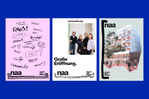
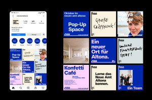
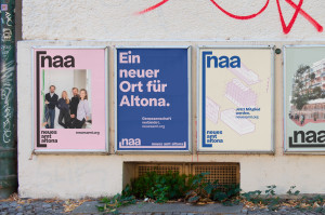
To mark the start of construction of the ambitious project, the NAA has a new visual and verbal brand identity, developed by Stan Hema. The revised identity combines a clear brand language, cross-media recognisability and the diverse voices of the more than 250 committed members. With heart, soul and conviction, they are designing a neighbourhood that is entirely geared towards people and community.
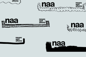
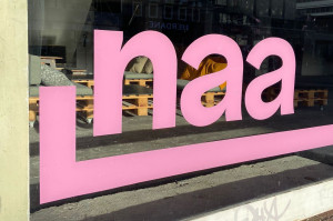
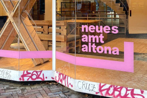
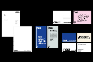
On the basis of intensive workshops, a brand promise was developed that brings together the NAA’s heterogeneous target groups. It forms the basis for the brand story, which not only conveys the mission of the project, but also communicates its future. The aim was a strong, uniform appearance that impresses across all media – be it a website or brochure, on social media, a construction fence or a poster.
At the centre of the new image is a key visual inspired by the history of the location. Based on a signature field, the square bracket rotated 90 degrees is a reminder that the NAA creates space for new ideas and perspectives. This flexible design element adapts seamlessly to all media and has become the visual anchor of the brand.
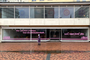
Until construction gets underway, the cooperative will be taking the mobile, visually unmistakable NAA neighbourhood kiosk to the centre of the action: the streets of Altona. There, it will provide information about the project, invite people to get involved and recruit new members. The new brand identity not only makes the NAA visible, but also tangible.
Zum Baubeginn des ambitionierten Vorhabens präsentiert sich das NAA mit einem neuen visuellen und verbalen Markenauftritt, entwickelt von Stan Hema. Die überarbeitete Identität vereint eine klare Markensprache, medienübergreifende Wiedererkennbarkeit und die vielfältigen Stimmen der über 250 engagierten Mitglieder. Mit Herzblut und Überzeugung gestalten sie ein Quartier, das ganz auf Mensch und Gemeinschaft ausgerichtet ist.


- Brand Strategy
- Brand Design
- Tone of Voice
- UX/UI Design
- Content Development
- Brand Guideline
- Arik Hohmeyer
- Daniela Vogel
- Lisa Geisler
- Maritta Seitz
- Niki Moreira
- Peer Hempel