Projects

Staatstheater Hannover

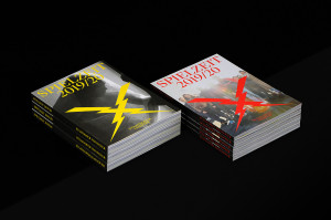
Staatstheater Hannover Spielzeitheft Cover

Less statesmanlike. Hello to impact! When a four genre arts venue provides inspiration.

Info

  • Staatstheater Hannover
  • 2019
  • Website

Strategy

  • Narrativ
  • Brand Architecture

Design

  • Visual Identity
  • Editorial

Transformation

  • Coaching

Radically reduced – but heated, loud and expressive: the new appearance for the Staatstheater Hannover is less statesmanlike than theatrical in the best sense of the word. We stage the four-genre establishment (theatre, opera, ballet, concert) as a disruptive factor, as a source of inspiration. The aim was to find a unified identity, to strengthen the sense of community within the establishment and to keep the genres as independent as possible. In order to not just formulate a manifest claim of impact but also to communicate this to the outside world.

Driving force in society
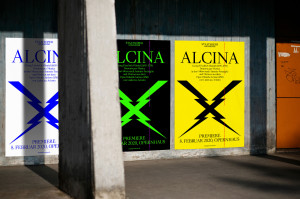
Key message for the umbrella brand strategy and the overall image: the state theatre is a driving force in society. The brand architecture was preserved. The jagged, feisty X as the visual core element clings to the entire communication and is charged with content. This logo, which looks like lightning strikes converging in the middle, symbolises the bundled power of the four-genre establishment. It can also be interpreted as a backbone. It moves responsively along the central axis as if along the spine, the sizes and layout of the word mark and design mark shift proportionally, infinitely scalable for different media, even in digital space. The impression: the opposite of static. The logo acts as a vehicle of meaning, as a movable, yet stable, structuring backbone of the state theatre cultural institution – and of society.

Staatstheater Hannover Plakate im Stadtraum

The collaboration
The focus was on strength and clarity, on expansion, within the process too. We developed the corporate design and a design system for the in-house graphics team. We enable the independent use and continuation of the design with our training sessions (also by the external digital service provider). The foundations were laid taking a participatory approach. Our season programmes for the theatre and opera genres (the theatre’s most comprehensive print publications) serve as templates for the monthly programmes, image campaign and seasonal communication.

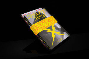
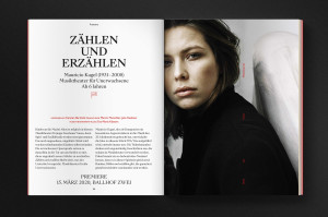
Staatstheater Hannover Spielzeitheft Cover mit Banderole Staatstheater Hannover Spielzeitheft Doppelseite Zählen und Erzählen mit Foto

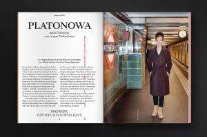
We were very pleased to pursue our clients’ requests to invite the photographers Sven Marquardt and Kerstin Schomburg to participate. Marquardt photographed the ensemble (opera and ballet) in Hanover and concentrated on staging the personalities; Schomburg met with the actresses at their homes and favourite places there. It was actually a matter of making a statement using design. We see it as a courageous, consistent step in our client’s brand development that aspects such as “beastly”, “ugly”, “cool” also found their place not just in the discussion but were thought about as provoking and polarising too. We provided our client with intensive advice and support. This was challenging, but also extremely target-focused – and efficient.

The fact that the work process itself was our design department’s responsibility means that the design results are exceptionally good and perfectly coherent for everyone: creating a corporate design in the best sense of the word. The Staatstheater Hannover found an appearance that embodies what strategically and artistically points to the future.

I am proud that we have succeeded in giving so much strength to a dynamic image. That it’s so electrifying. Loud, expressive, alive.
Mathias Schulz
Design

Staatstheater Hannover Spielzeitheft Doppelseite Salome Staatstheater Hannover Spielzeitheft Doppelseite Platonowa mit Foto

We succeeded in bringing the multi-genre establishment’s artistic management team together for the first time (from Berlin, Hamburg, Hanover, Karlsruhe and Basel). As a result, we were able to work together on the strategy and verify what the establishment stands for, with the artistic visions and the great commitment of all involved: to be a driving force in society.
Mathias Illgen
Managing director, partner

The fine-tuning and finale were incredibly exciting. Our team fought for the favourite, our client struggled with it, we also reached extreme points during our collaboration. We were all concerned with teasing out the establishment’s (new) orientation, interpreting it in a coherent way and making it visually perceptible.

The result: an unmistakable cultural brand. An establishment with cult potential. And extremely practical in terms of implementing and using the new image. Our cross-media modular system gives the Staatstheater Hannover at least ten years of communicative and creative leeway: the four genres can act independently, redesign and combine their artistic scope. New interdisciplinary formats, festivals, etc. reflect the establishment’s flexibility and staging freedom in terms of content. This is likely to spread throughout the urban space and perhaps even have an impact beyond the city and state borders.

Conclusion: The development of a new image here led one-to-one to reflecting on and further developing the self-image.

The Staatstheater Hannover is marketing itself and distinguishing itself on the theatre scene; with its strong visuals, it is positioning itself more powerfully than ever on the cultural scene – and, completely new, on the design scene. A highly pleasing “side effect” with appeal to new target groups.

Contact person

Mathias Illgen
Brand consulting, Managing director
Mail
LinkedIn

More

bauhaus now
Brands need design and language.

Cover des Magazins bauhaus now für das Jubiläum 100 jahre bauhaus

Deutsches Symphonie-Orchester Berlin
Open to the world through closeness.

Mitglieder des Orchesters in Berlin mit Fahrrad vor dem Berliner Dom