Two traditions. One new identity.
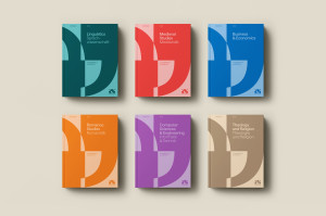
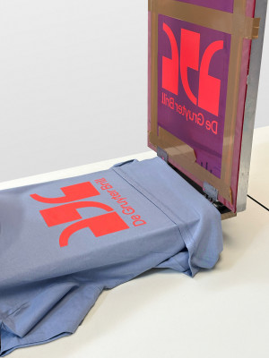
The merger of De Gruyter and Brill marks the beginning of a new chapter in the long history of two scientific publishers. Stan Hema developed the brand strategy and visual identity of the new De Gruyter Brill brand.
Walter de Gruyter GmbH, founded in Berlin in 1749, and Koninklijke Brill BV, founded in 1683 in Leiden, in the Netherlands, both family-owned companies, are among the largest specialist publishers in the world. Following the merger, the joint portfolio comprises more than 30 scientific departments, ranging from historical first publications (Immanuel Kant, Friedrich Nietzsche) to monographs and anthologies, as well as international reference works and journals.

