Projects

David+Martin

Expressive design for an expressive duo.

Info

Design

  • Visual Identity

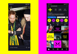
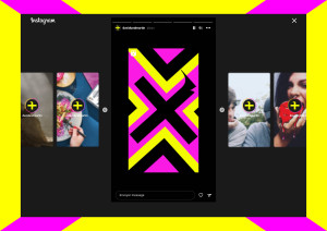
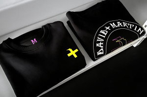
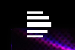
The creative agency David+Martin makes it plain on its website: “Working with us means having the courage to do things differently.” And that’s exactly what we have done. For the new visual image, we developed a modular system with design elements and colours that are just like the creative agency David+Martin itself: expressive, loud, transcending boundaries.

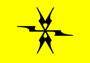
The creation of the design elements was experimental and pushed beyond the boundaries of the standard design system. After all, David+Martin don’t fit inside any mould, and nor does our design. It provides orientation without any restrictions. How? Through the flexible use of gaudy colours and expressive elements that can be put together to produce unconventional layouts.

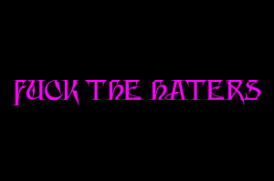
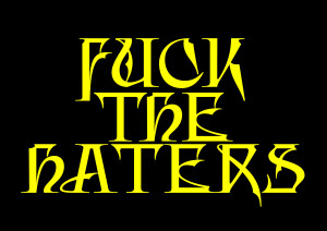
A font with corners and edges. And colours ranging from loud to soft.
The agency’s brave approach is most clearly reflected in the display font by designer Fabian Maier-Bode and André van Rueth. What makes it special is that the lines are full of character, reflecting the nature of the agency and underlining the strong brand design. We decided on black and white for the primary colours to provide orientation. Then there are the gaudy secondary colours, ranging on a scale from loud to soft, depending on the content and channel.

Daniela Vogel, Designer

“When we met David+Martin, we immediately recognised their passion and their desire to ensure that nothing they do is ordinary. But above all we sensed how much they enjoy what they do. Ensuring clarity without losing sight of the joy of experimenting was an exciting challenge for us.”

Contact person

Daniela Vogel
Design
Mail