Movement as an expression of music, rhythm and energy.
Info
- Berliner Philharmoniker
- 2022–
- Website
Design
- Verbal Identity
- Visual Identity
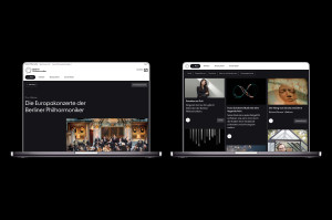
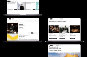
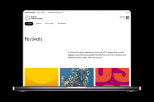
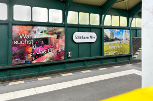
What makes a cultural brand like the Berliner Philharmoniker successful? It’s the connection of the quality of the concert hall to an expressive motion design that shapes the recognisable brand elements into a uniform design language. The motion design, co-created with designer Aljoscha Höhborn, was based on the brand strategy and corporate design of creative director Oliver Helfrich and strategist Cecilia Martín.
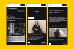
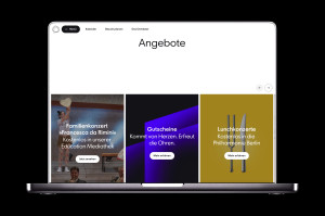
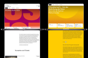
What makes the new motion design so special? It opens up new perspectives for making the Berliner Philharmoniker brand even more vibrant in the future. It’s also more visible on all media thanks to scaling, rotation and speed, and is based on strong design principles: expressive, proud, accessible, dynamic. For example, the most important brand element of the Berliner Philharmoniker, the Pentagon, is being transformed into dynamic layouts and animations. It shows UI behaviours that represent the movement of sound and rhythm.
During the collaboration, everyone involved was guided by a shared motto: Working together to grow together. ‘Especially when working as a creative unit, you need a good sense of tact, vigilance and empathy in order to understand and react to the needs of the group as well as the individual,’ emphasises designer Salina Gandji.