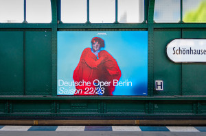
See for yourself: The brand identity of the most democratic opera in the world.
Info
- Deutsche Oper Berlin
- 2011–2017
- Website
Strategy
- Brand Strategy
- Brand Architecture
Design
- Visual Identity
Transformation
- Communication
- Training
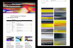
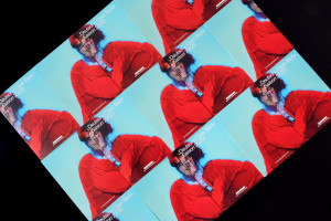
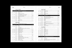
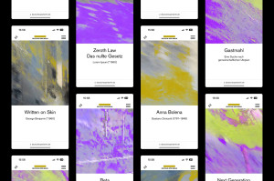
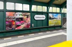
Deutsche Oper Berlin is the most democratic opera house in the world, and it shows: in its proud history as an opera house for all people, in its architecture, and in the audience it attracts, both young and old. Stan Hema reworked the brand strategy and communication for the 100th anniversary of Deutsche Oper Berlin and the inauguration of its new director, Dietmar Schwarz. Following the guiding idea of Opera without Airs, we designed all media with a view to the needs and expectations of modern citizens who like theater: the strategic target group of Deutsche Oper. The logo, typeface, and color of the brand’s new look and feel reference the tradition of this renowned opera company and make it visible in the present.
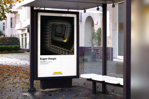
When Sascha Weidner shoots photos, he transforms visible reality into cipher. For the 2014/2015 season he found his inspiration for his photos in operas by Xenakis, Britten, Shostakovich, Puccini, Berlioz, and Gounod – and the results are stunning, both in content and visuals. They cut to the heart of what is relevant for us today in these works. For the reopening of the main stage of the Deutsche Oper in November, these works are on display in the foyer.
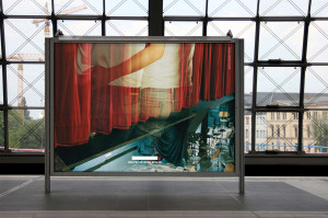
Heji Shin developed the photo project for the 2013/2014 season. The photo artist worked with multiple exposures of 35mm film, superimposing everyday scenes from Berlin with shots of the opera. The facade, orchestra pit and auditorium merge with monuments, plants, and protest demonstrations. The artist thus provokes viewers to do what good musical theater demands: to form their own opinions.